Chip-In:
A Group Savings App
A money management app for young people to save towards goals together; staying social whilst financially responsible.
Research & Analysis
Branding
Wireframing & Prototyping
Figma
Adobe Illustrator
Adobe Photoshop
8 weeks
Sept-Oct 2024
Solo work
Student project
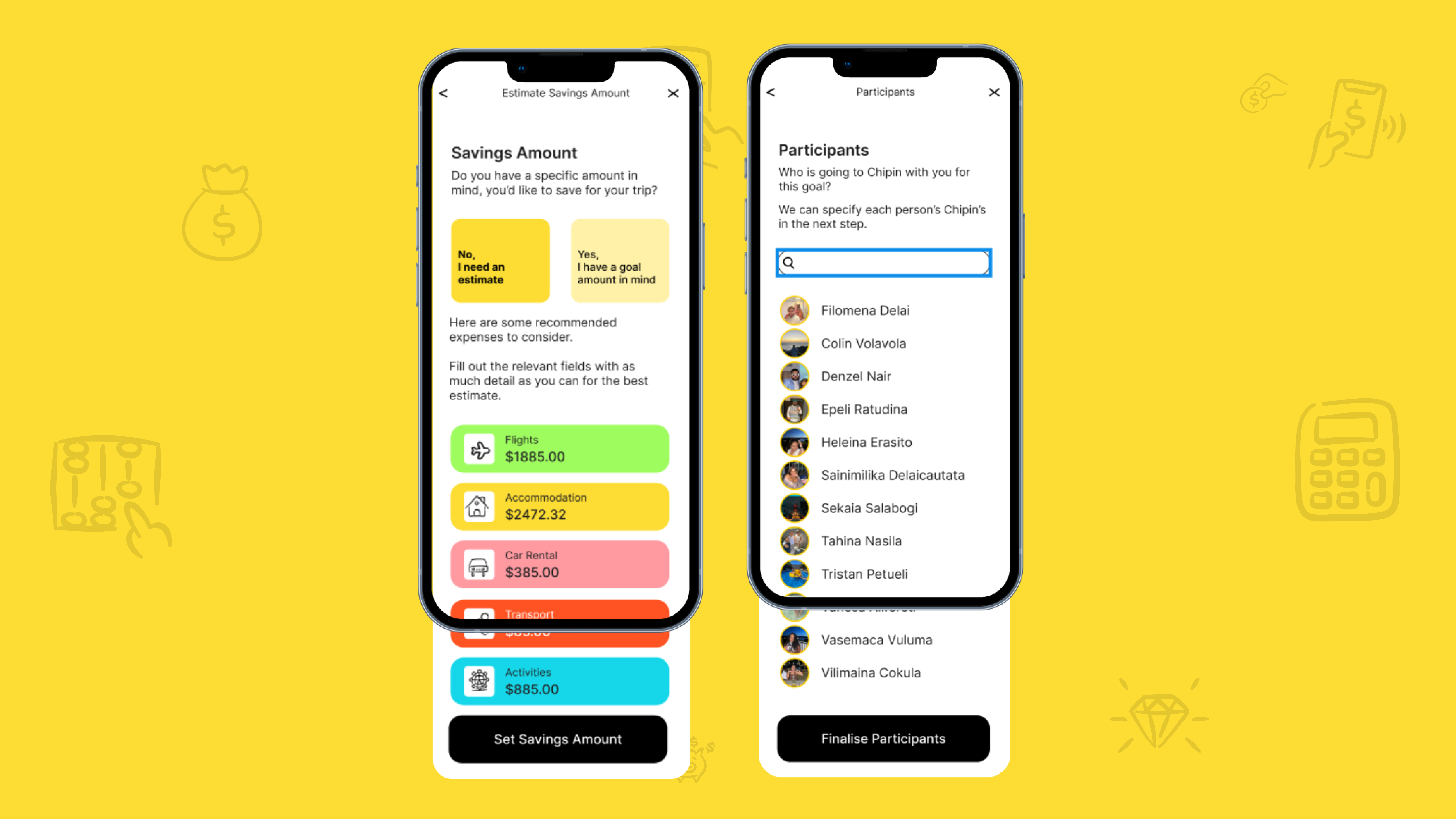
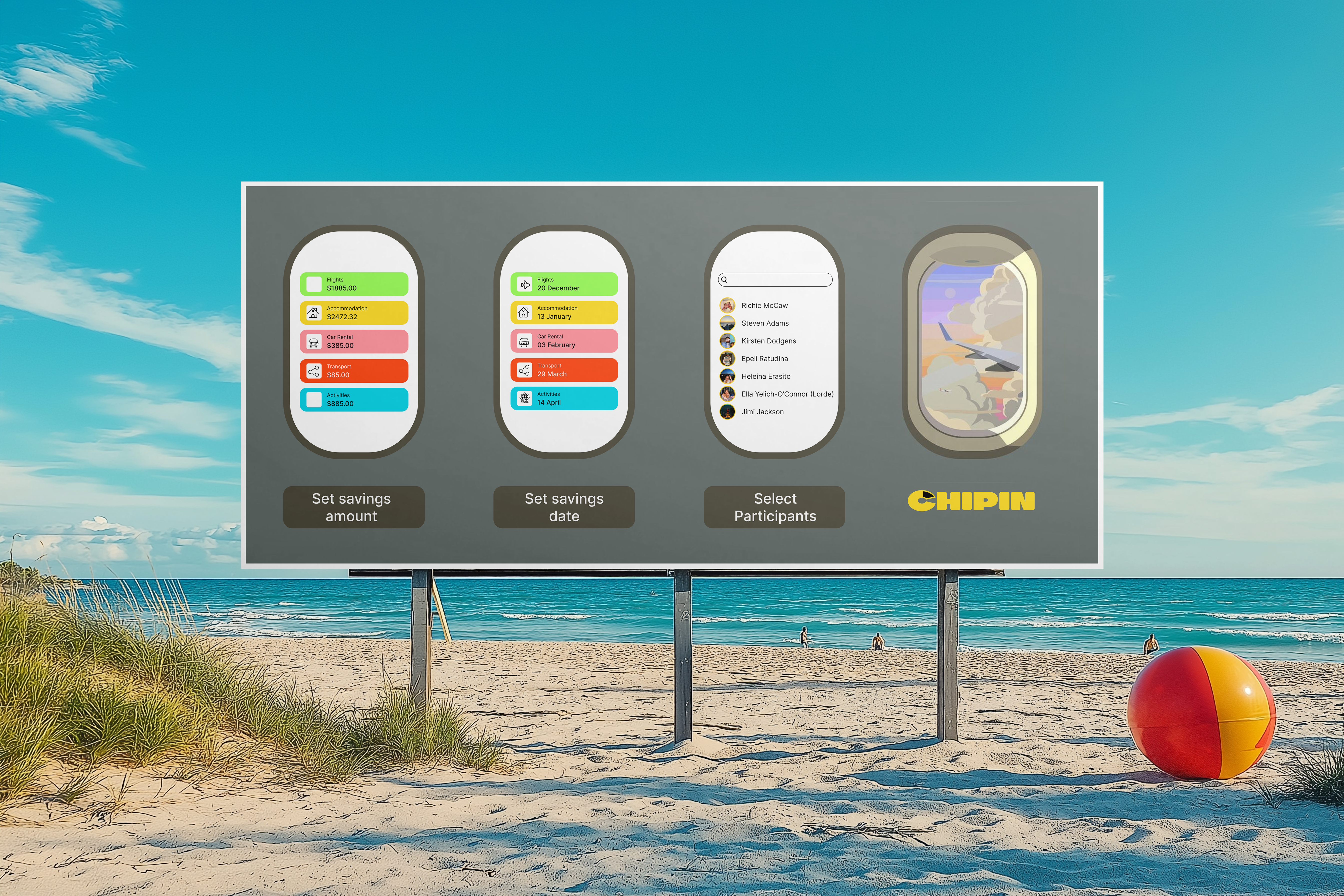
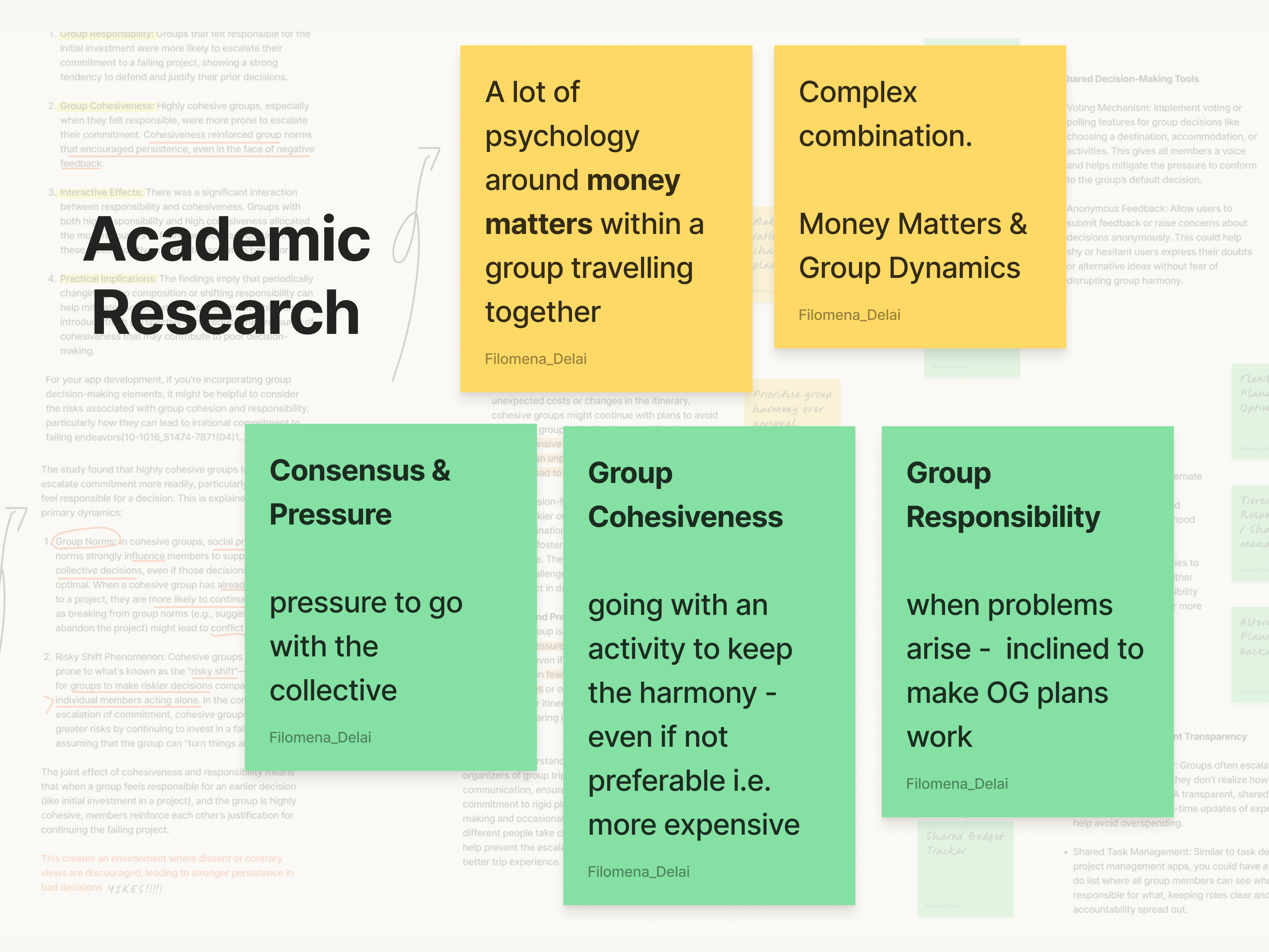
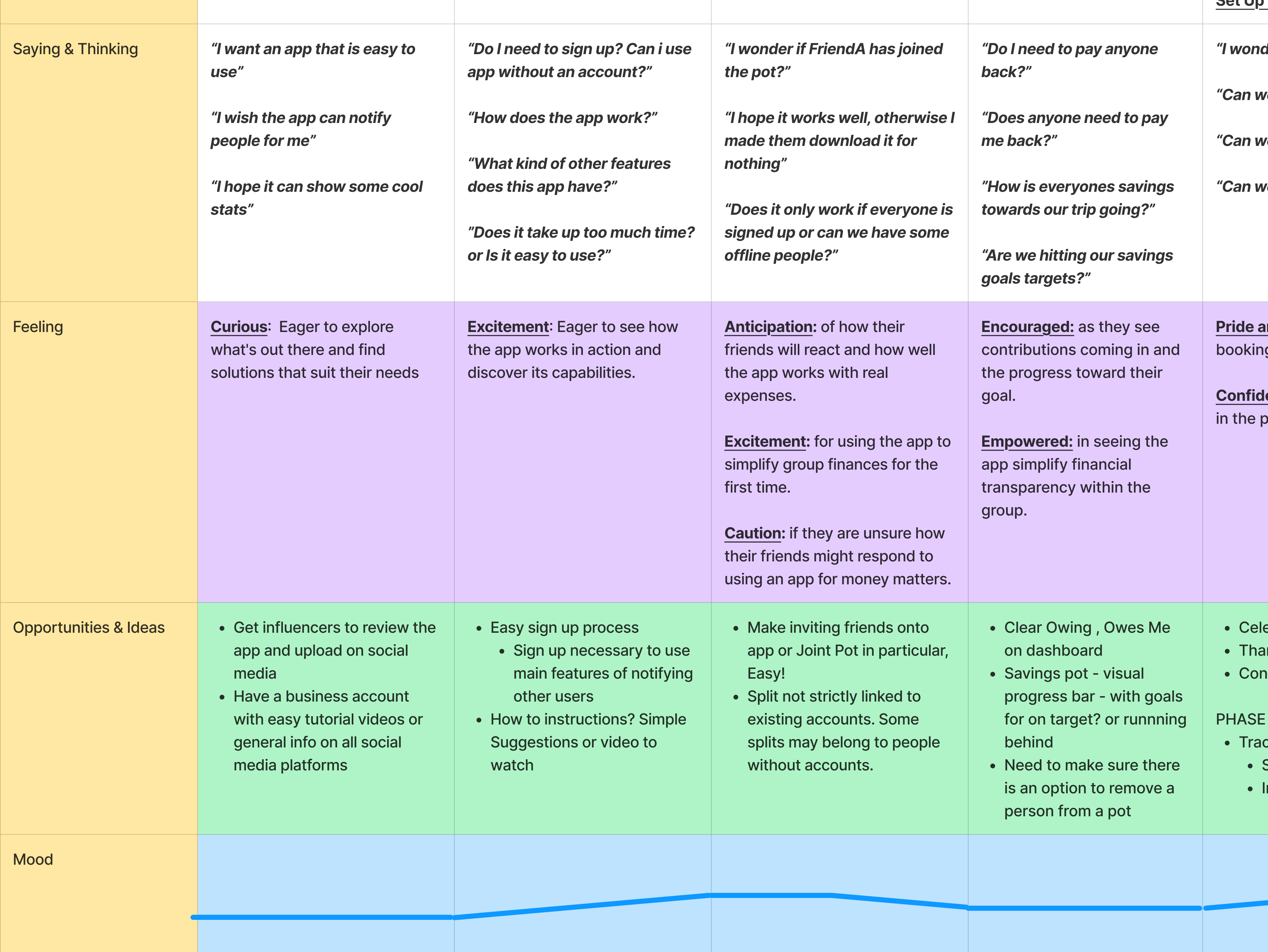
Group trips can be a great way to connect, but managing shared expenses often causes stress — whether it's one person always paying or chasing others for their share.
There are tools that exist that can help groups split costs but that is always after the fact.
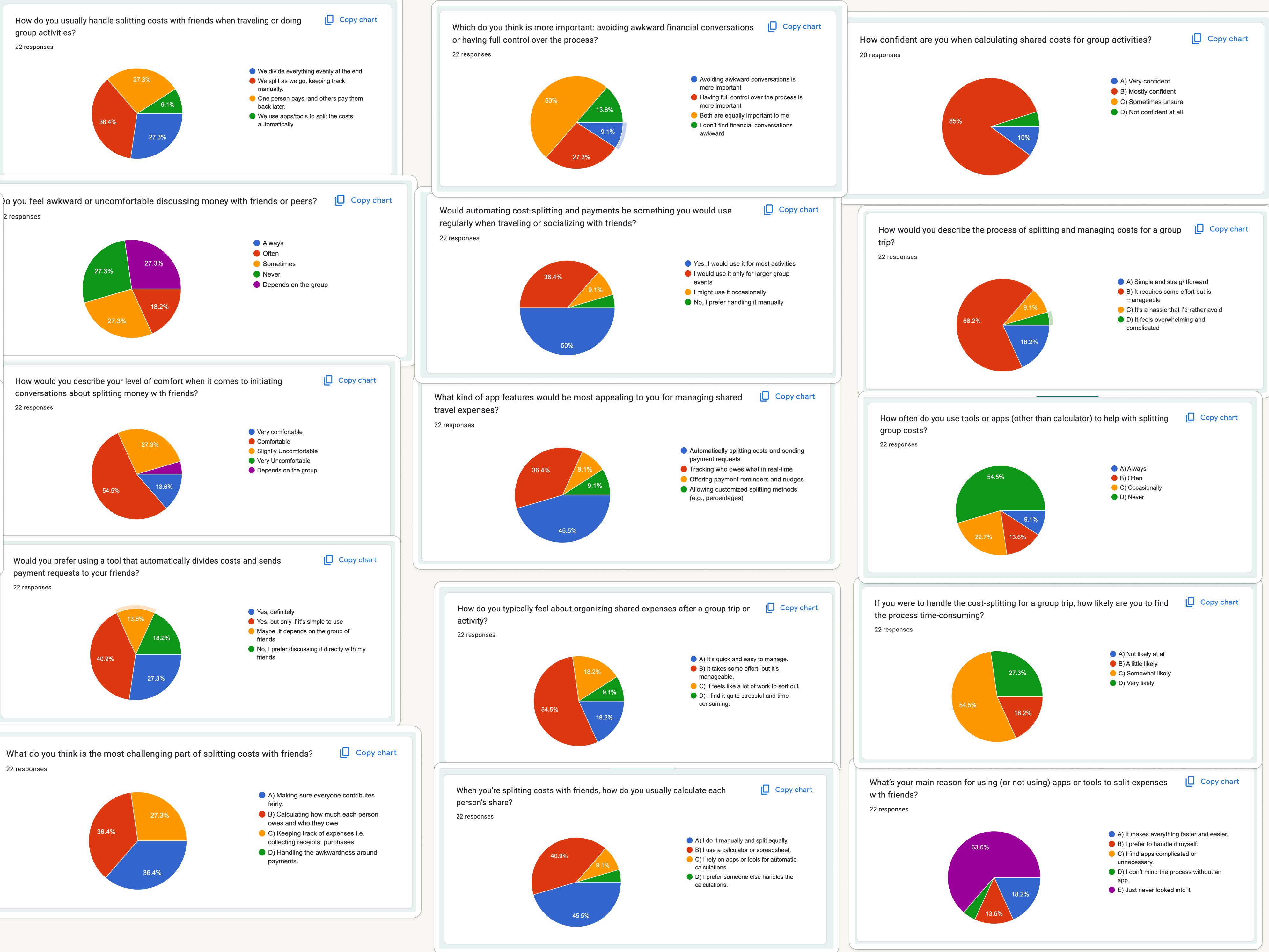
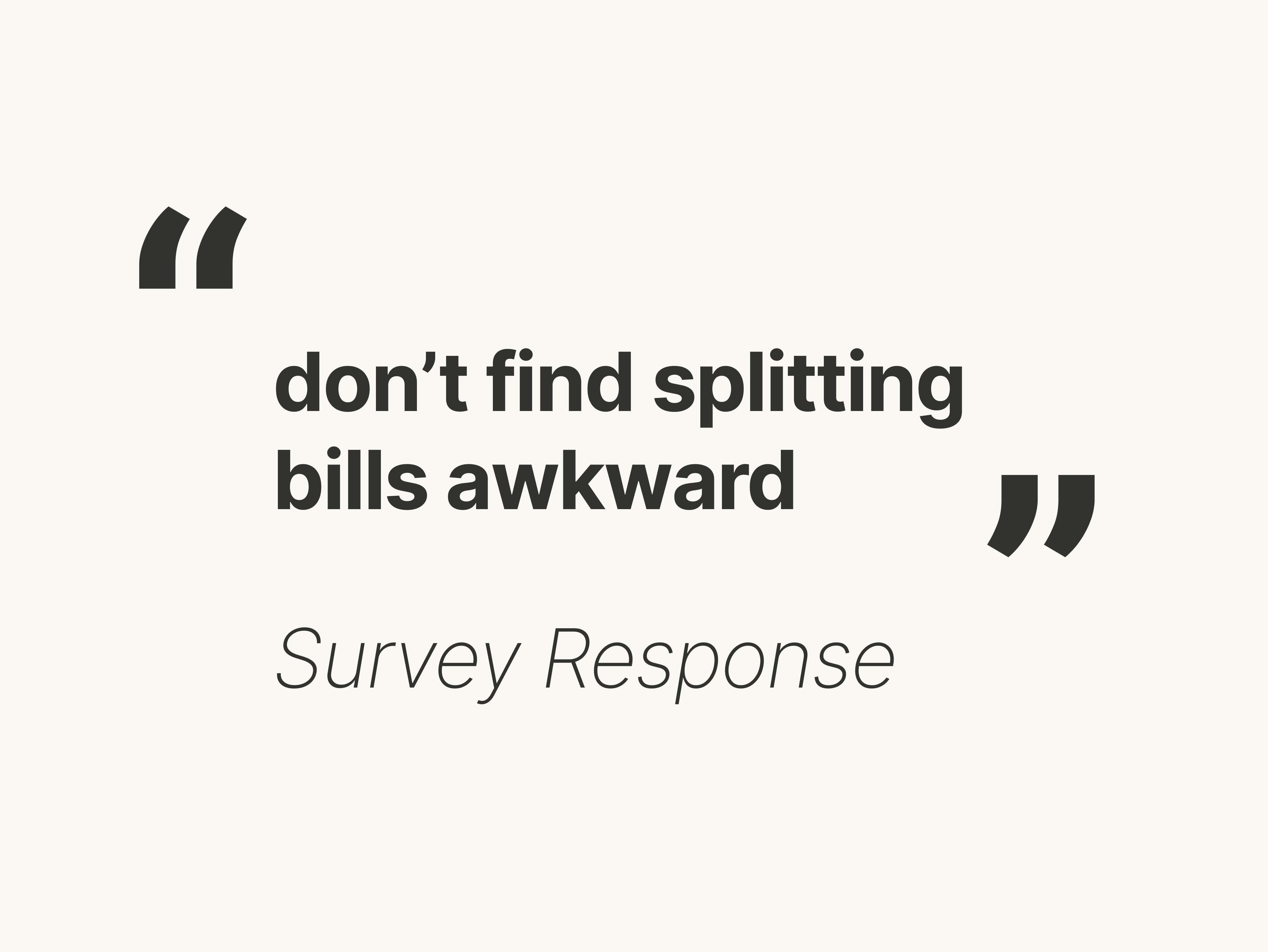
We found out that people don't actually think having that conversation is awkwward but we know shared goals build connection, especially when everyone feels included and in control.
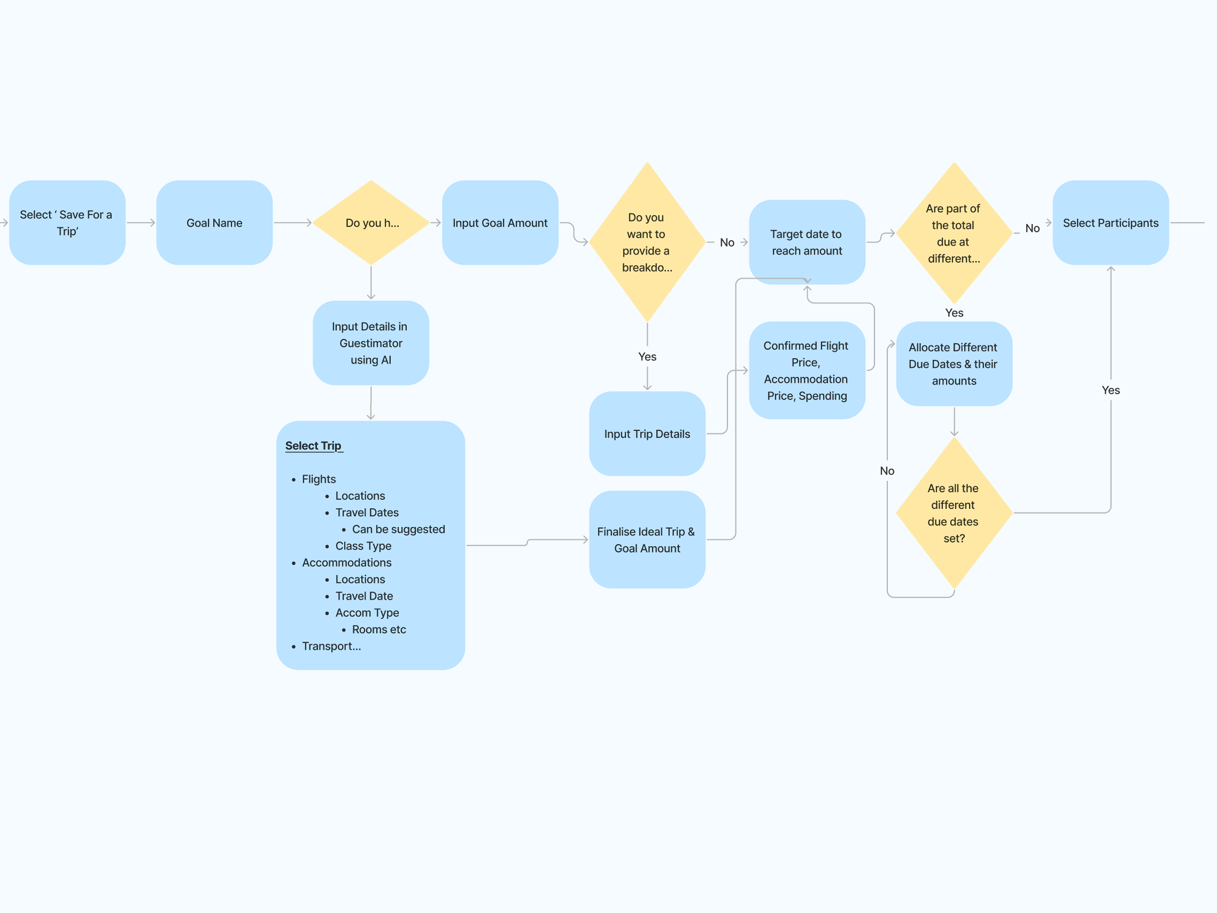
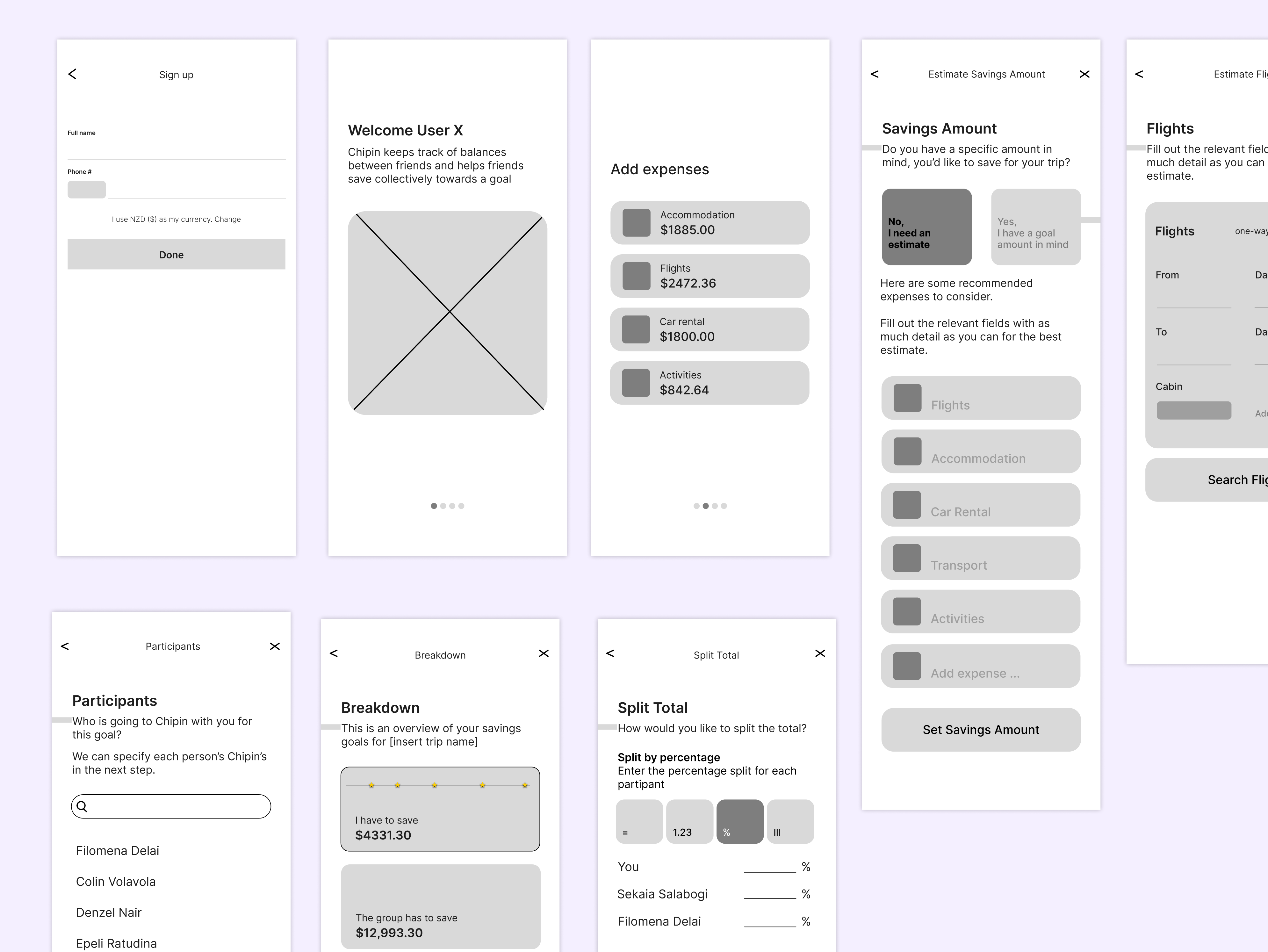
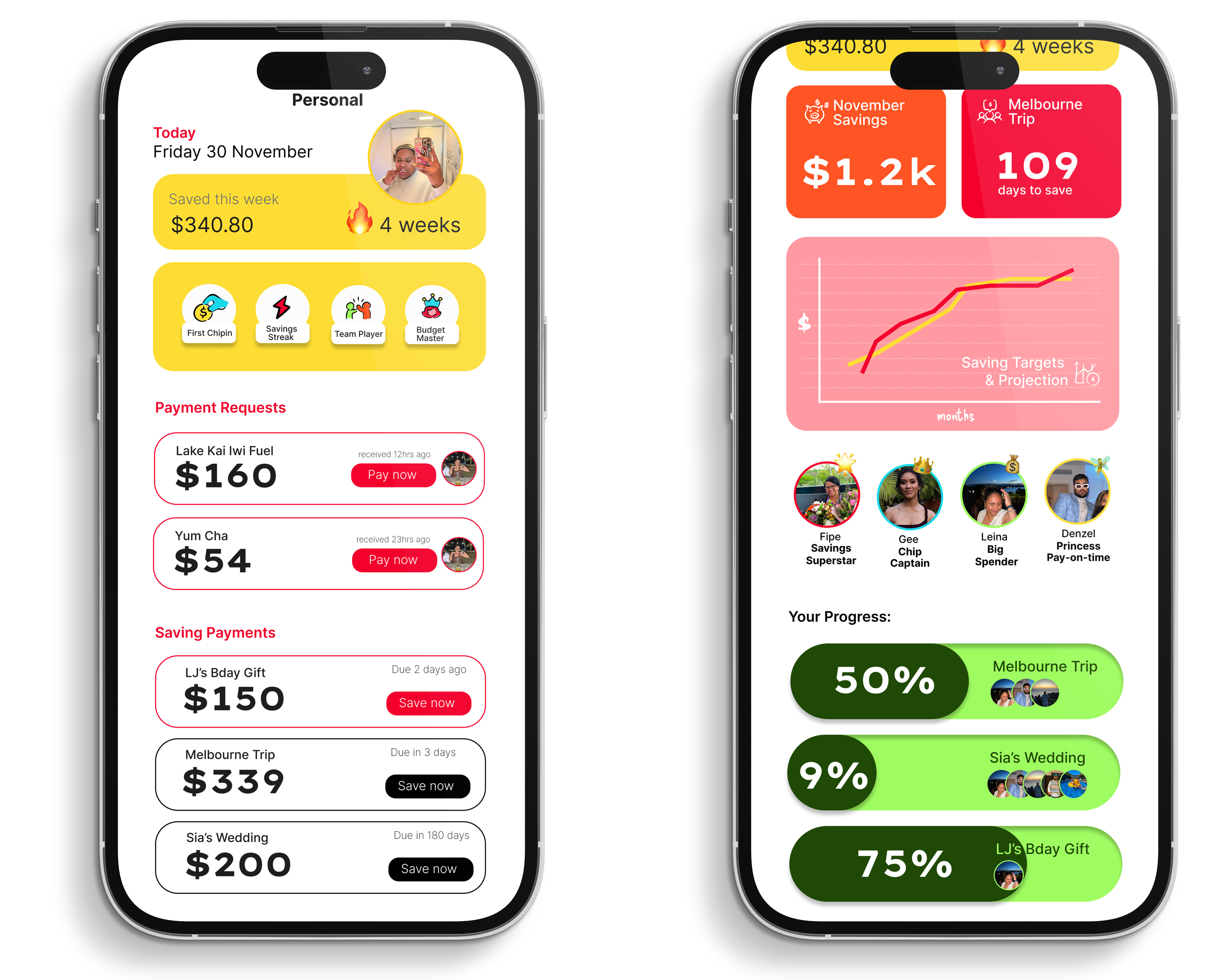
How might we design an app for a group of people to save money together, making travel feel fair, fun and friendship-first?